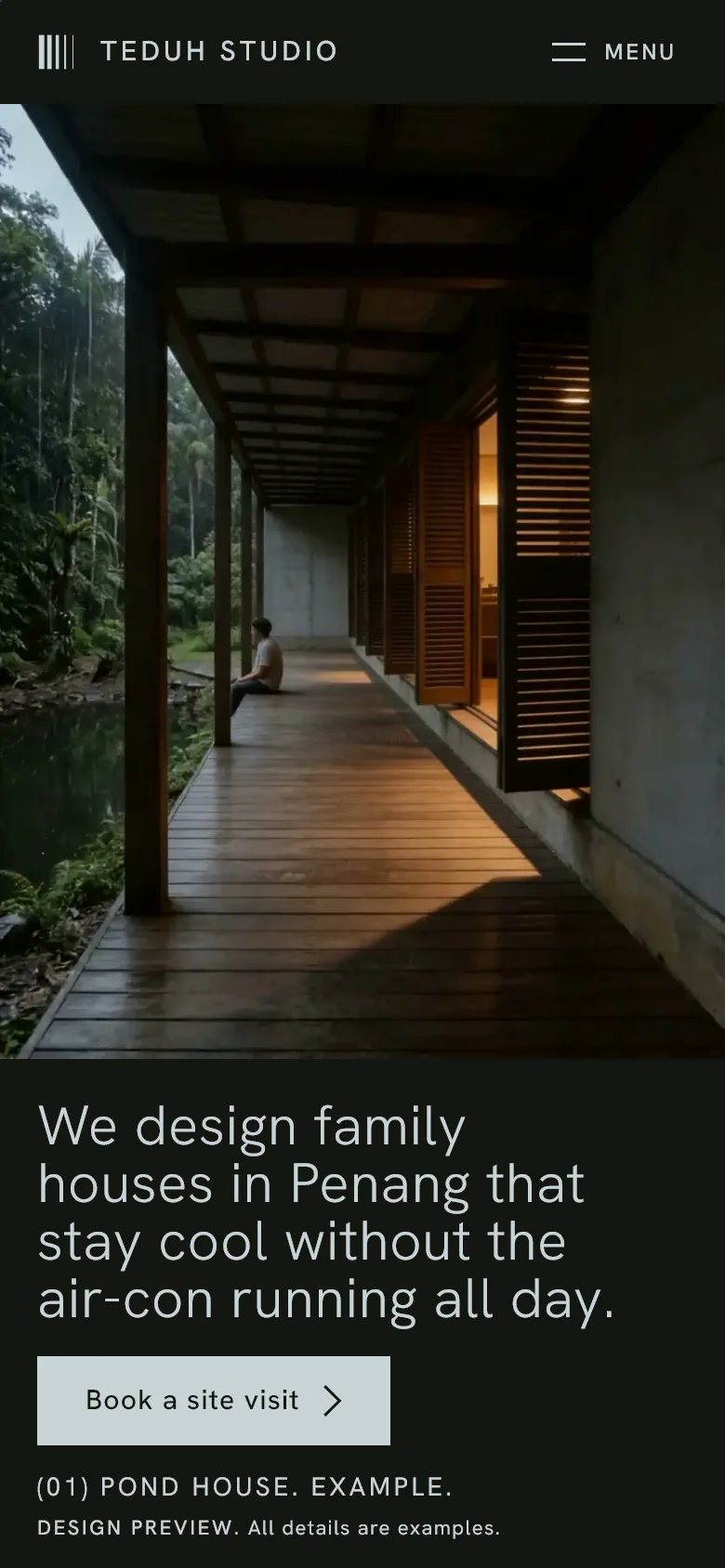
Website · architect · Malaysia · concept
Teduh
An architect's site that opens like a timber shutter.
- Made
- The site, with a booking for a site visit
- Pages
- Houses, how we work, fees, the studio
- Status
- Concept, not a real practice
Concept · the brief I set
- The practice
- An invented architecture studio in Penang, Malaysia, for family houses and renovations. Teduh is Malay for shaded.
- The idea
- Houses that stay cool without the air-con running all day: the roof, the shade and the air path first, the air-con last. And the fee, told before anything is drawn.
- For
- A family or couple in Malaysia or Singapore, or an expat, with a plot of land or an old house.
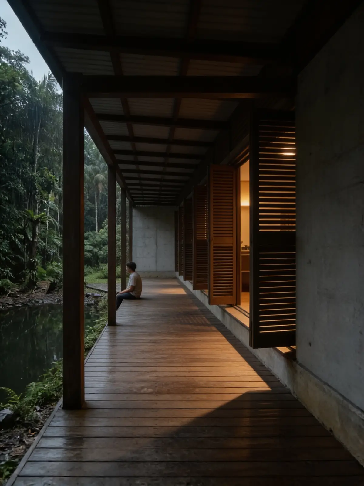
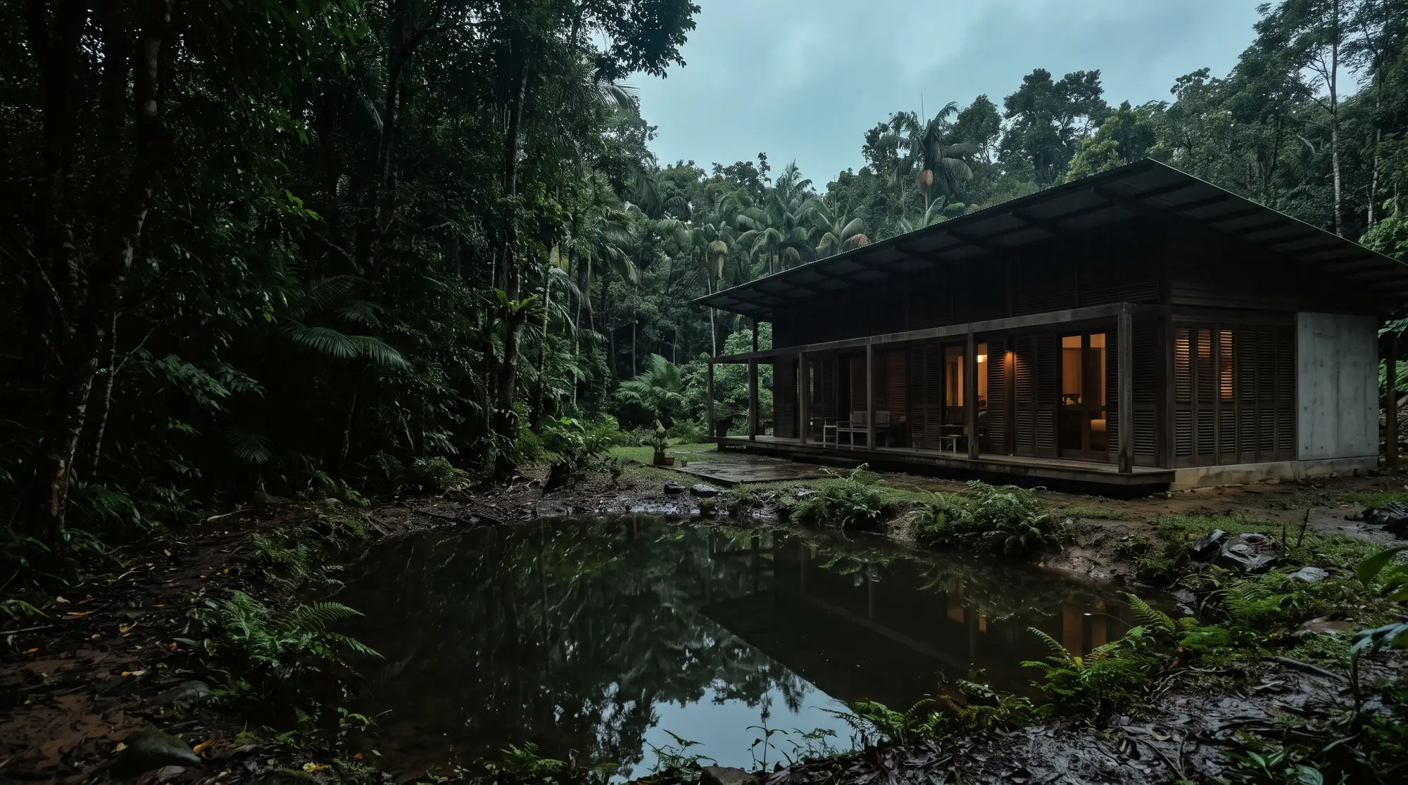
Teduh Studio is a concept, not a real practice. The studio and its houses are invented, and so are the fees. Every picture is a generated illustration labeled as an example. The Penang council and the Board of Architects Malaysia are real, and named on purpose. The design decisions are real.
01 · Understand
What a family checks before hiring an architect.
I started with what people check before they hire an architect, in order. The concept is built around two fears: the quote that comes back double, and a pretty house that is hot inside.
- 01
Finished houses like theirs
Not the firm's best work. Work like the house they want.
- 02
Who designs it
A named person, and who builds it.
- 03
What it costs
The fee, and what the fee covers.
- 04
How long it takes
And who deals with the council.
- 05
Whether anyone answers
Silence after paying comes up in bad reviews.
02 · Investigate
Thirty practices' sites, and the gap between them.
I read 30 architecture sites. The best-looking ones say almost nothing about cost, stages or who does what. The plainest ones look like templates. So the site had to be beautiful enough for an architect's eye and plain enough for a homeowner who wants the cost, the stages and who answers.
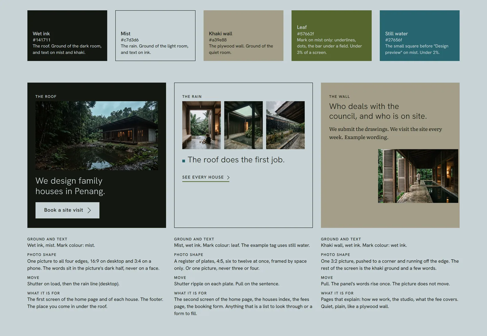
Then I measured five sites at laptop and phone width, Bark, Hijjas, Andramatin, Guz and Cereal magazine, for the grid, where the pictures sit and the type. The five colors were sampled from the first screens of five practices' sites.
03 · Identify
Lead with the building. Answer with the fee.
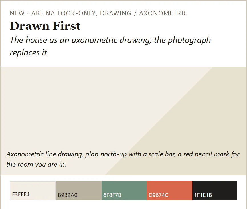
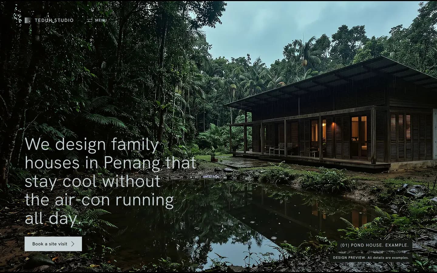
The first direction came from the research alone: a practice whose site led with line drawings, chosen for the buyers' worries. It was bland, with no finished work in it. Award-winning practices lead with the building.
So the look leads, and the research decides what the pages say. The offer became one sentence: family houses in Penang that stay cool with the windows open, and the fee before we draw. The look is a creative choice. What the pages answer comes from the research.
04 · Define
Seven pages planned. Eleven built.
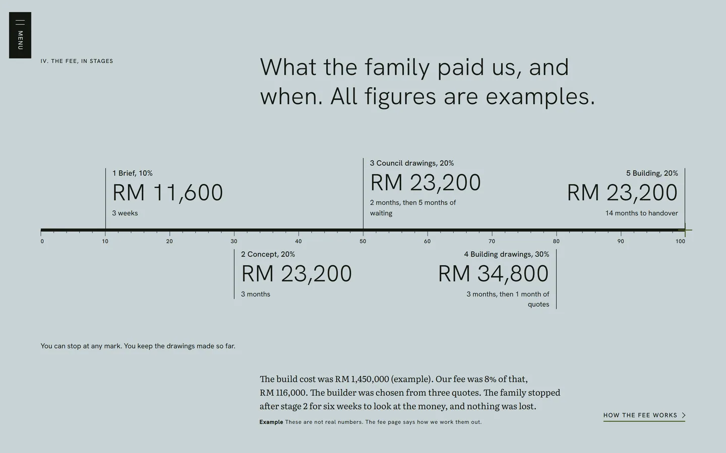
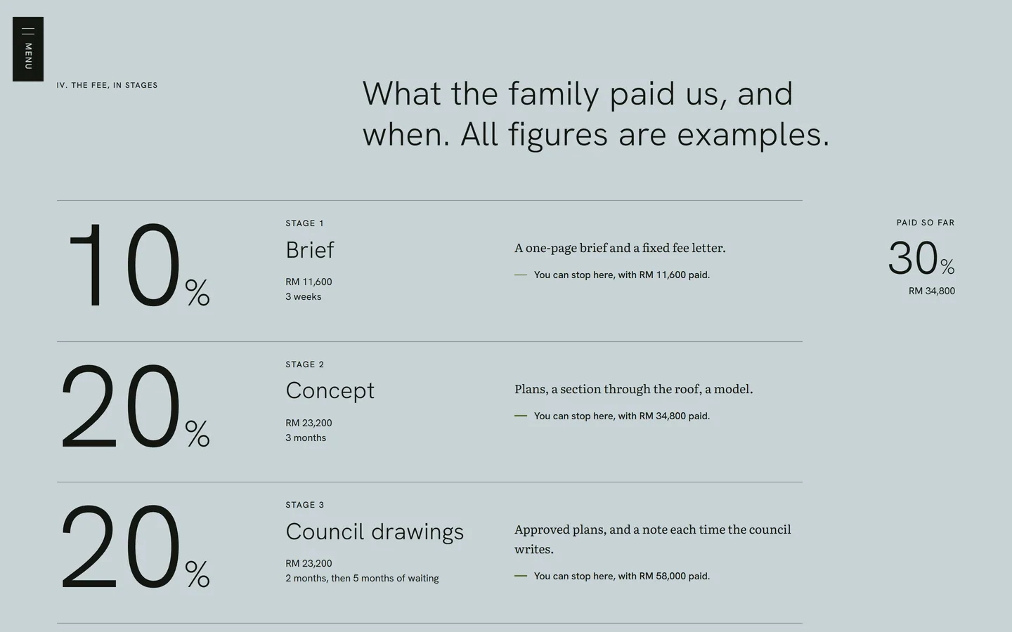
Every page got a job: show the work, or lead to a site visit, the one action on every page. Each also got a list of what it must say, never where. The fees page must say what each stage costs as a share, what isn't included and what changes it.
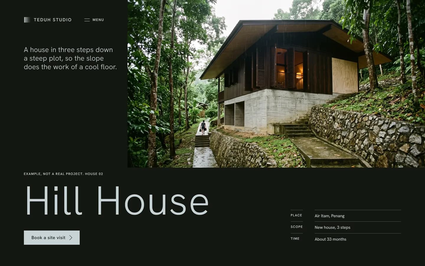
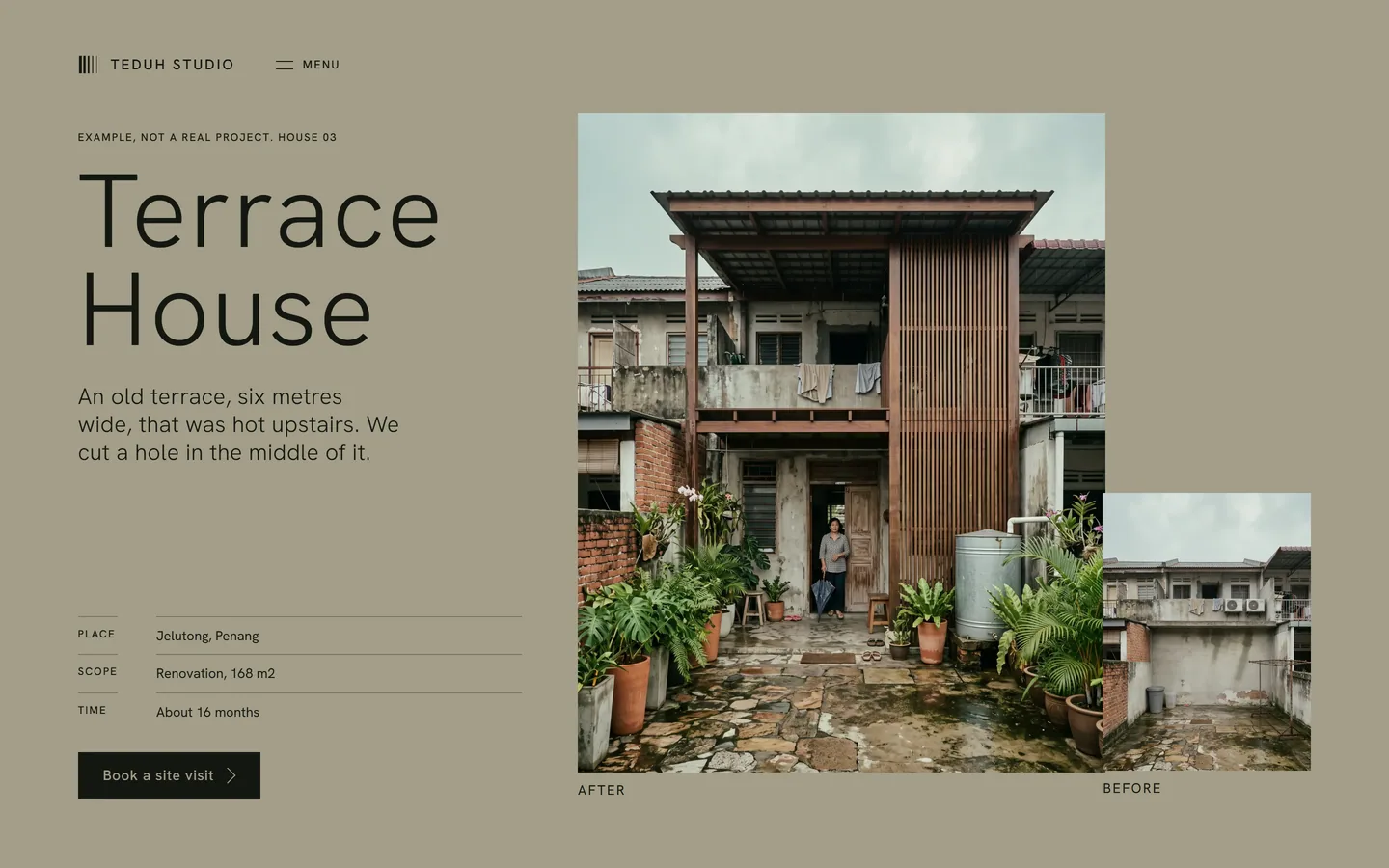
One house page became three, because finished houses like theirs are the first thing a family checks. With a privacy page and a page for a wrong address, that made eleven.
05 · Create · the world
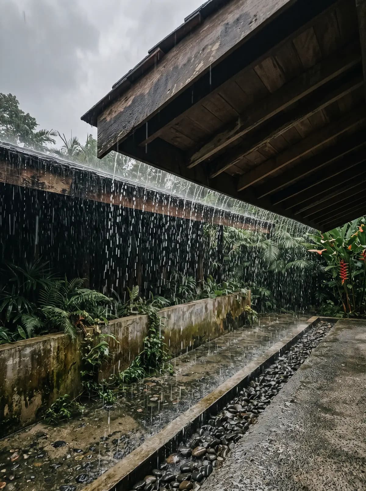
A deep roof, wet green and still water.
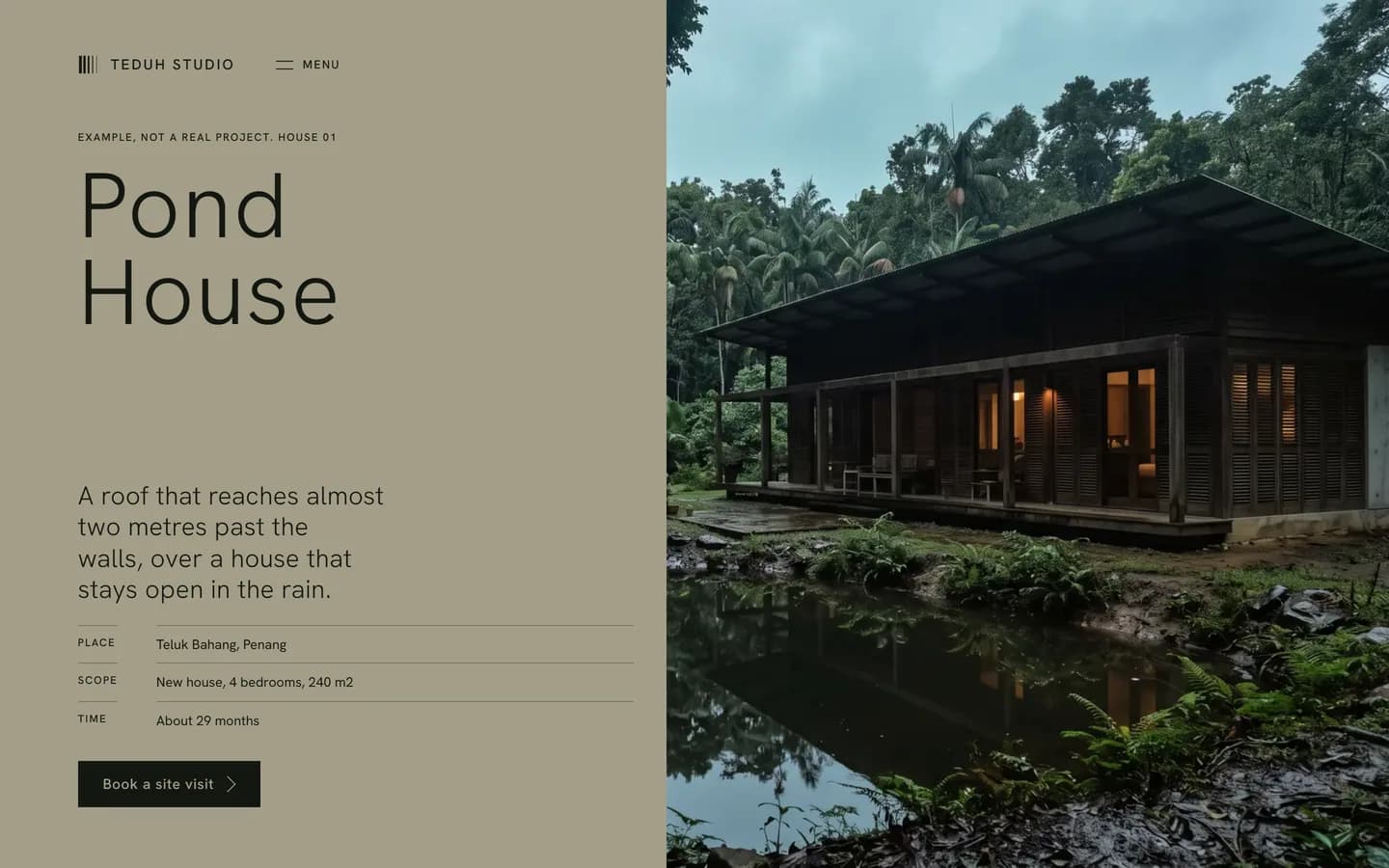
I drew up five worlds from five looks: tropical, courtyard sun, desert, old and new Europe, and forest. This one is Monsoon Verandah. Shade is the main material, and you can feel the rain coming. It's set in Penang because I love Malaysian architecture.
The light is soft and overcast after rain, with dark timber, raw concrete and people small in the frame. It must never look like a resort brochure.
06 · Create · the rulebook
A short rulebook every page follows.
I wrote the rules down, so every page looks like the same studio.
- 01
Type
Hanken Grotesk for headlines, set light and a little wide. Literata for reading.
- 02
Color
Words only sit on the dark ink, the mist or the khaki. The green and the blue are lines and marks, and buttons are never green or blue.
- 03
Rooms
Roof: one picture to every edge. Rain: rows of pictures, lists and forms. Wall: one picture in a corner and a few words. Two sections in a row never share a room.
- 04
Layout
One picture per screen, or a row of six to twelve. No cards, shadows or rounded corners, and the first screen is never centered.
- 05
Pictures
At full strength, never dimmed.
07 · Create · the first screen
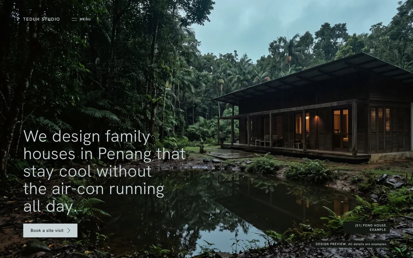
Three first screens. The photograph won.
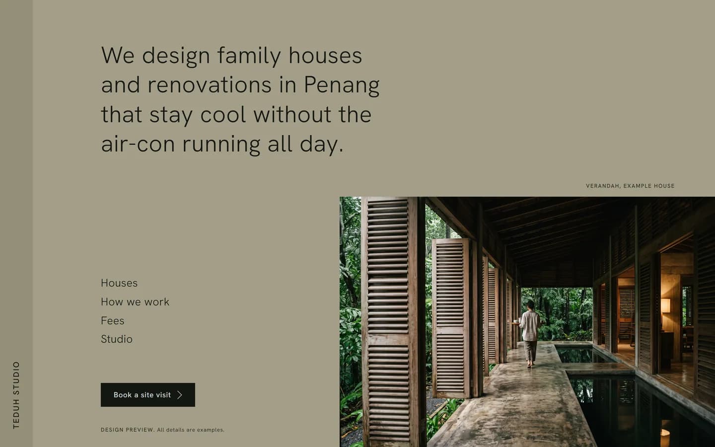
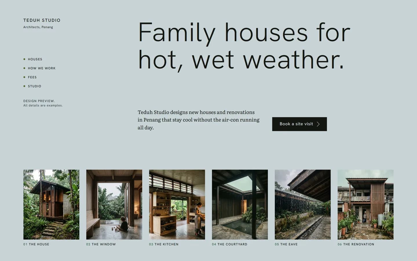
I drew three first screens: a picture to every edge, a khaki wall with a picture pushed into a corner, and six small pictures under a headline. The first won, with the third's row of six under it, because the photographs deserve to be full size. They put you in the world.
The khaki wall became the Wall room, for the pages that explain.
08 · Create · the shutter
One move: the timber shutter.
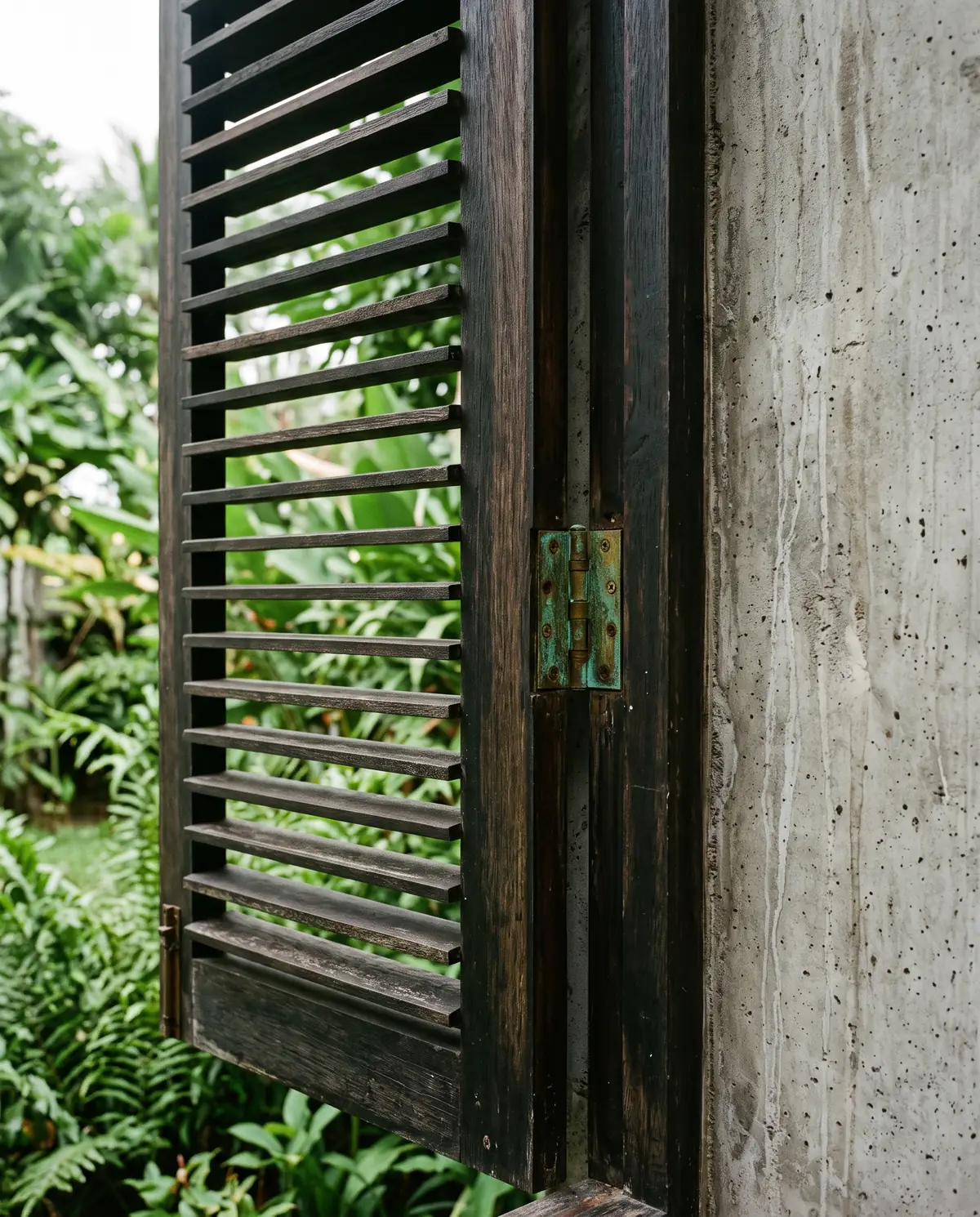
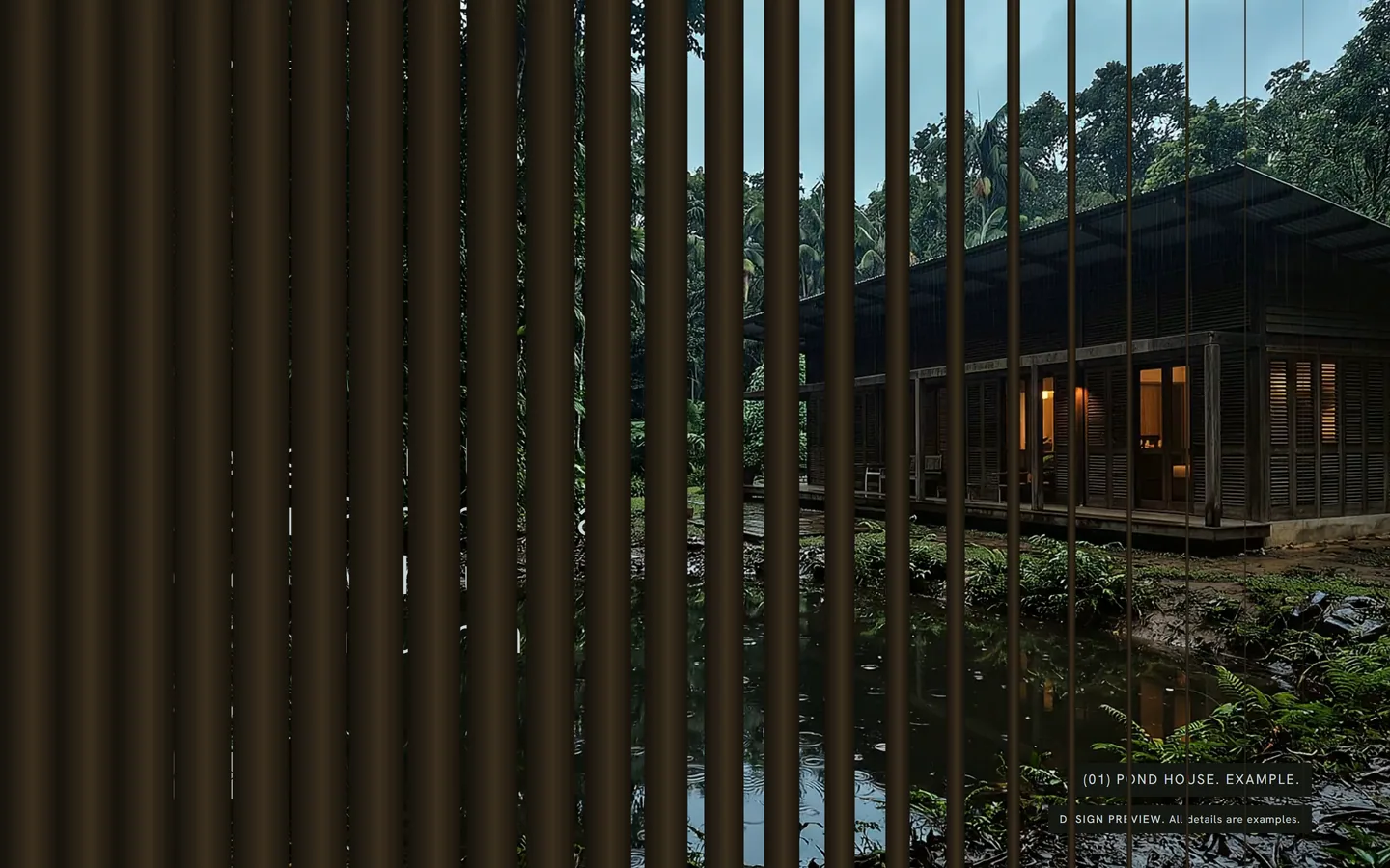
The brief puts shade and moving air before the air-con, and a louvre gives both, so the timber shutter became the site's one move. The home picture opens through timber slats, each row of pictures opens as it scrolls in, and the slats ripple under the pointer. The logo is five slats.
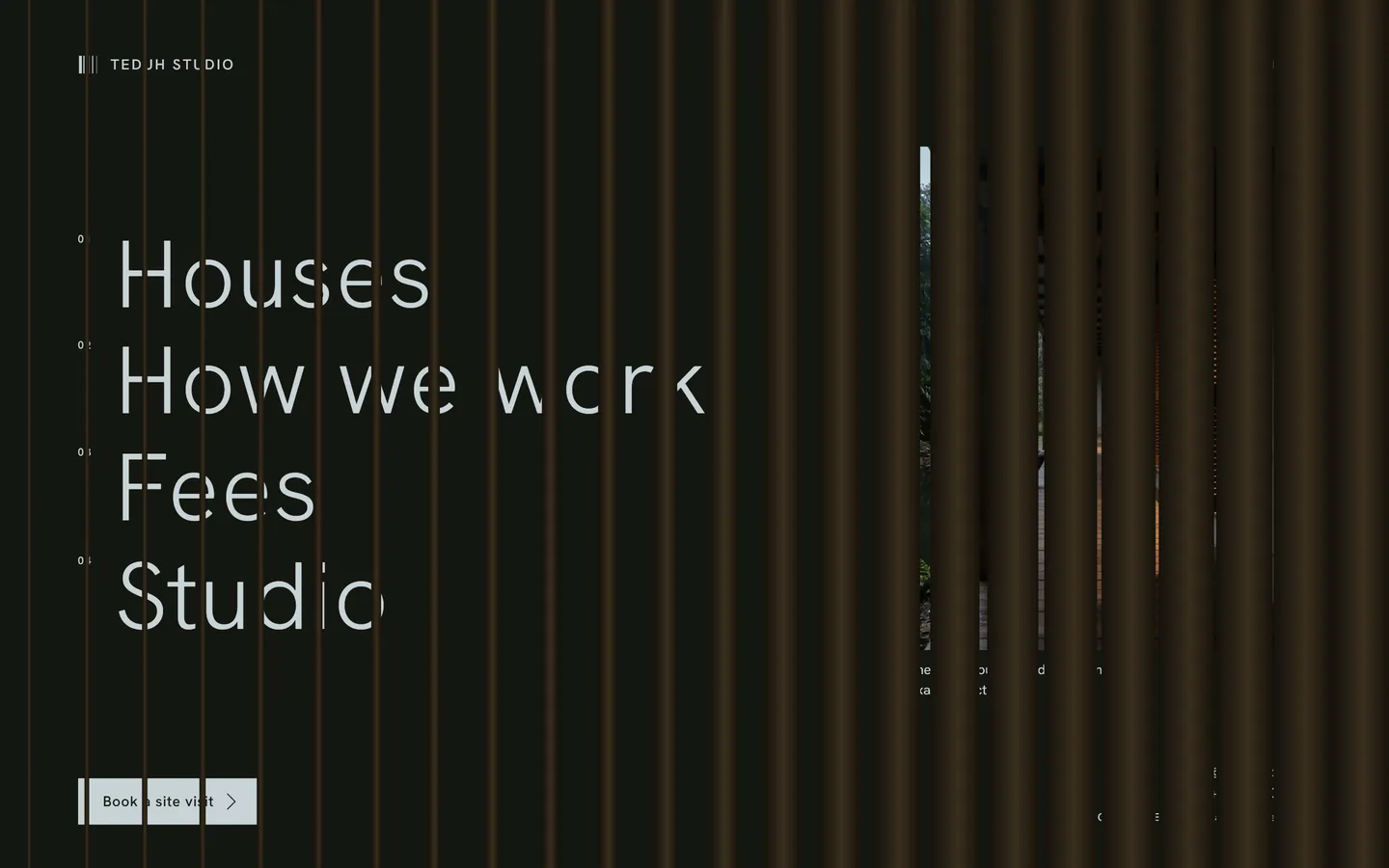
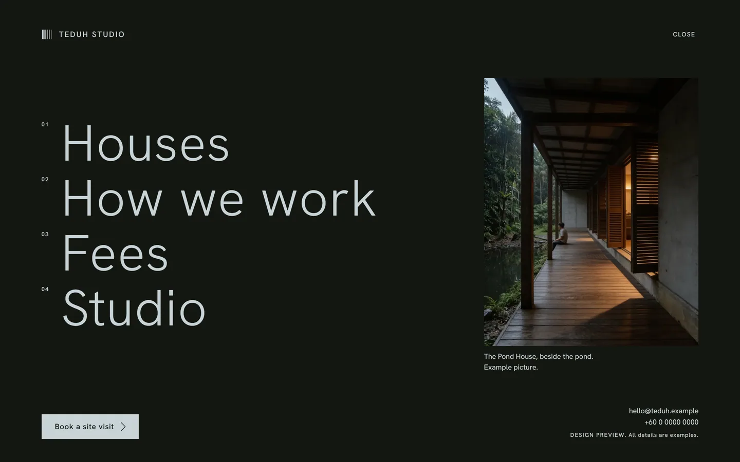
The menu closes 24 slats across the screen and opens them onto the pages, and moving between pages does the same. The slats never rest shut over a photograph, because they would hide it.
For anyone who turns motion off, nothing moves and every page shows whole.
09 · Refine
Eighteen options, each built on the real pages.
Ten days after it went live, I walked the site again on laptops and a phone, like a stranger. Not enough moved, the fees sat still, and the menu cut the headline mid-word. I drew up 18 options in six rows. One step at a time, I build a row's three options on Teduh's own pages, with its own pictures, so the pick is made from the real thing.
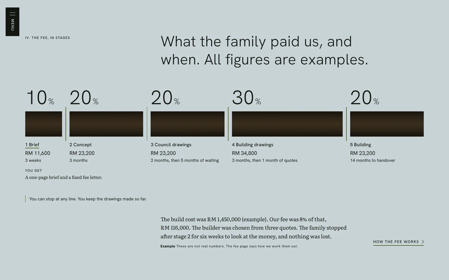
The picks so far: the shutter menu, the fee as five timber blades, the roof drawn as you scroll beside a plan set as a working drawing, one film on the home page, and bigger pictures of the three houses. The booking page and a final check are still to come.
Next