



Website · cosmetic dentist · UK · concept
Ottoline
A dentist's site set out as a fashion magazine.
- Made
- The site, with a reply-card booking
- Pages
- Treatments, fees, smiles, the dentist
- Status
- Concept, not a real practice
Concept · the brief I set
- The practice
- An invented cosmetic dentist in Bloomsbury, London: one dentist and one ceramist, five minutes from Russell Square.
- The idea
- An editorial identity built around the dentist and the ceramist, carried through treatments, cases, fees and booking.
- Who it suits
- A small practice that wants to look like a fashion brand, not a clinic.
Ottoline is a concept, not a real practice. Every name, fee, case and review on the site is an example. The photographs are illustrations, not patients.
01 · The idea
A fashion magazine about one dentist.
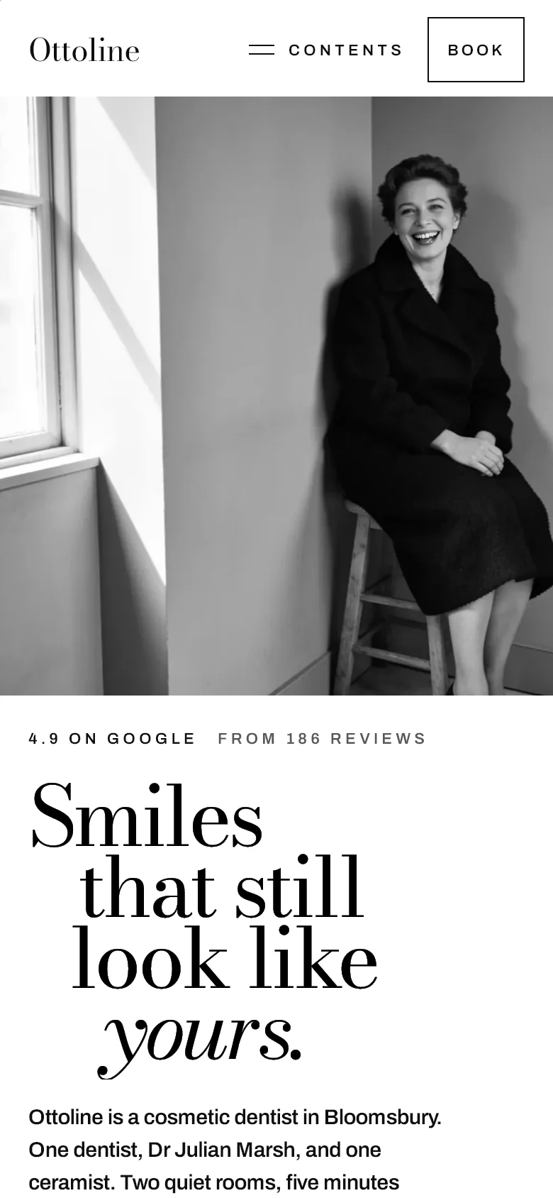
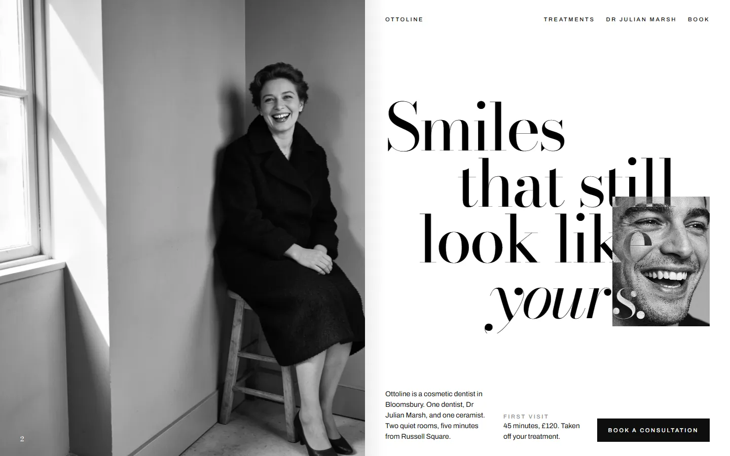
Tallis is about a building. Ottoline is about two people: the dentist, and the ceramist who makes the teeth. So the site reads as a magazine about them. The type is very large against black and white portraits, and the facts are set like photo credits.
The words follow the same idea. They're short and a little dry, and the headlines are statements. It never says luxury, flawless or Hollywood smile.
02 · Finding the first screen
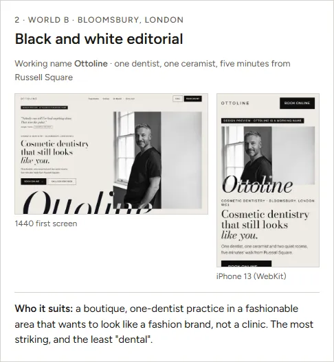
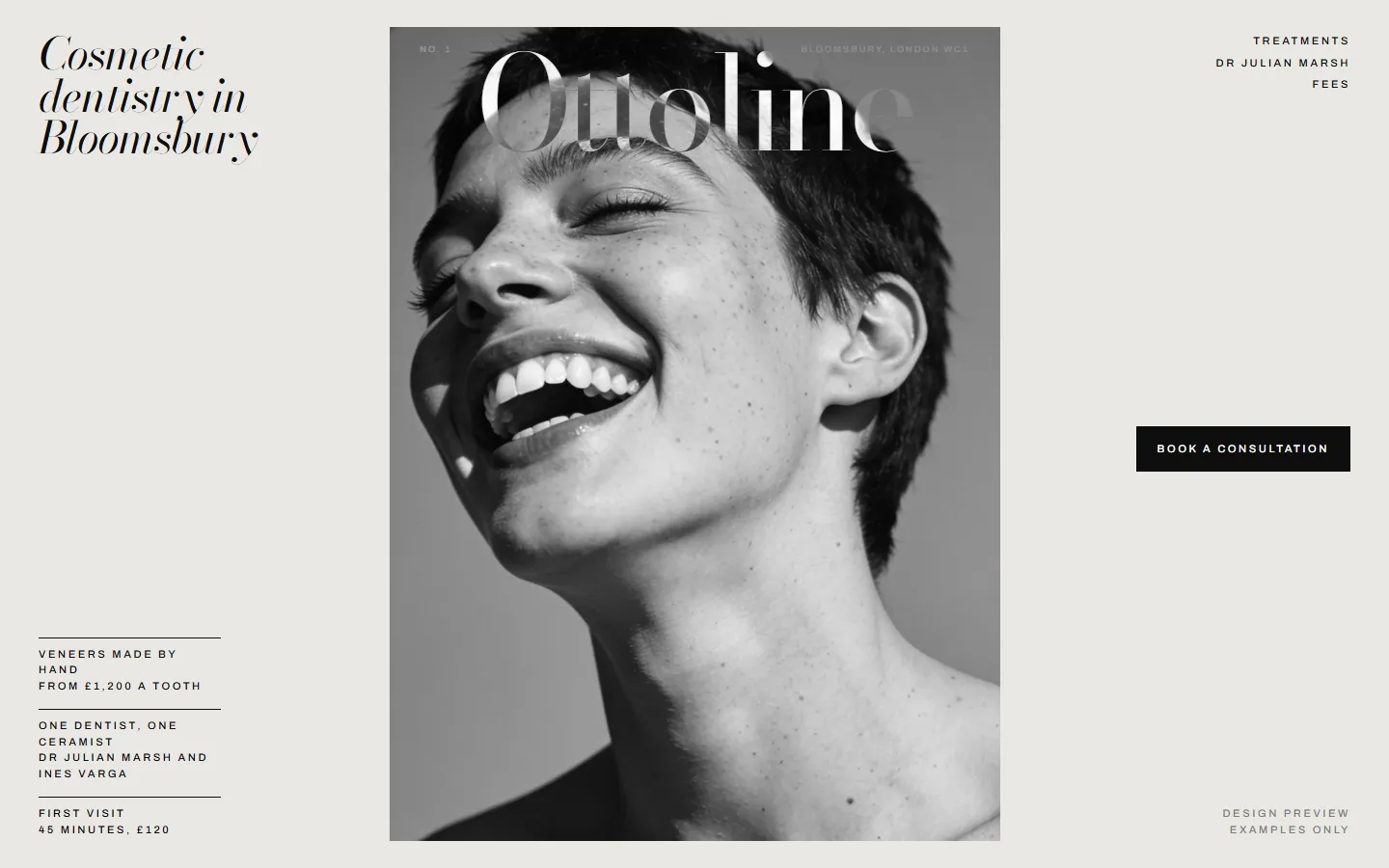
A cover, a spread or a contact sheet.
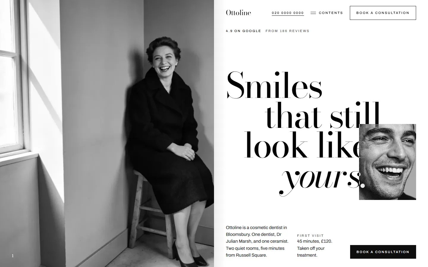
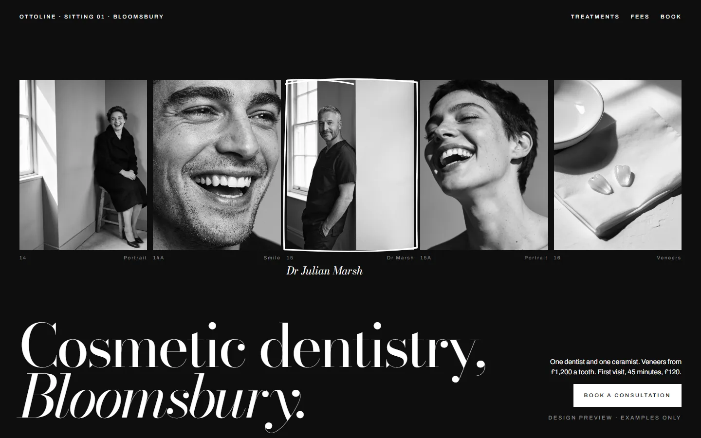
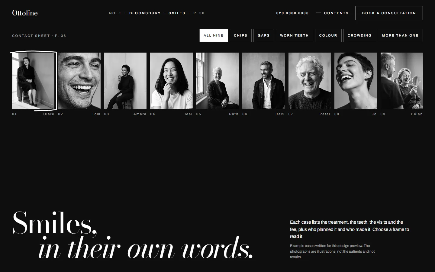
I drew three first screens: a standing cover, a two-page spread and a contact sheet. The spread became the home page, with a portrait on one side and the headline stepping down the other, the way a magazine opens a feature. The contact sheet became the smiles page.
Down the page, heavy spreads alternate with calm ones, like turning through an issue.
03 · Every page a different spread
No two pages share a layout.
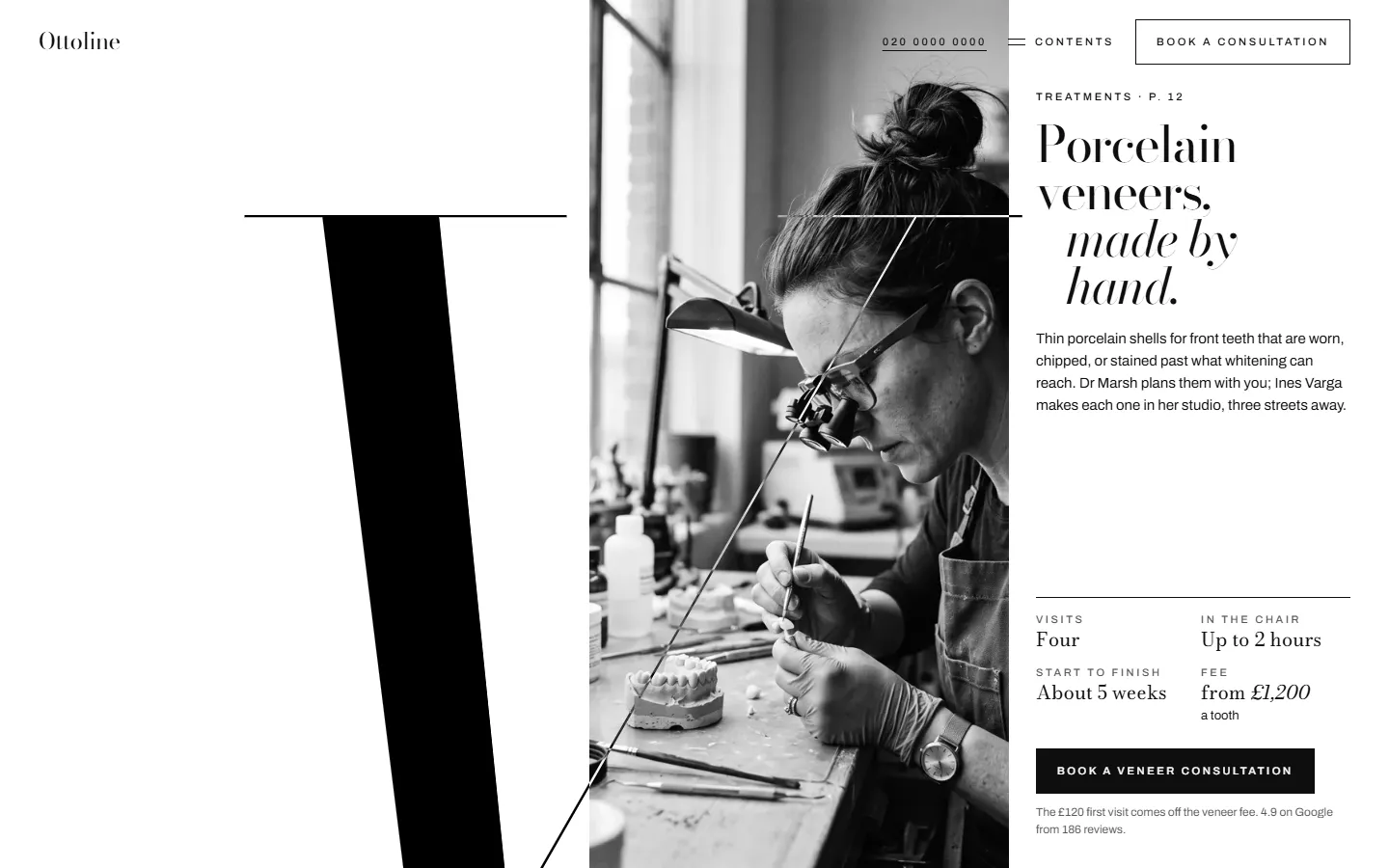
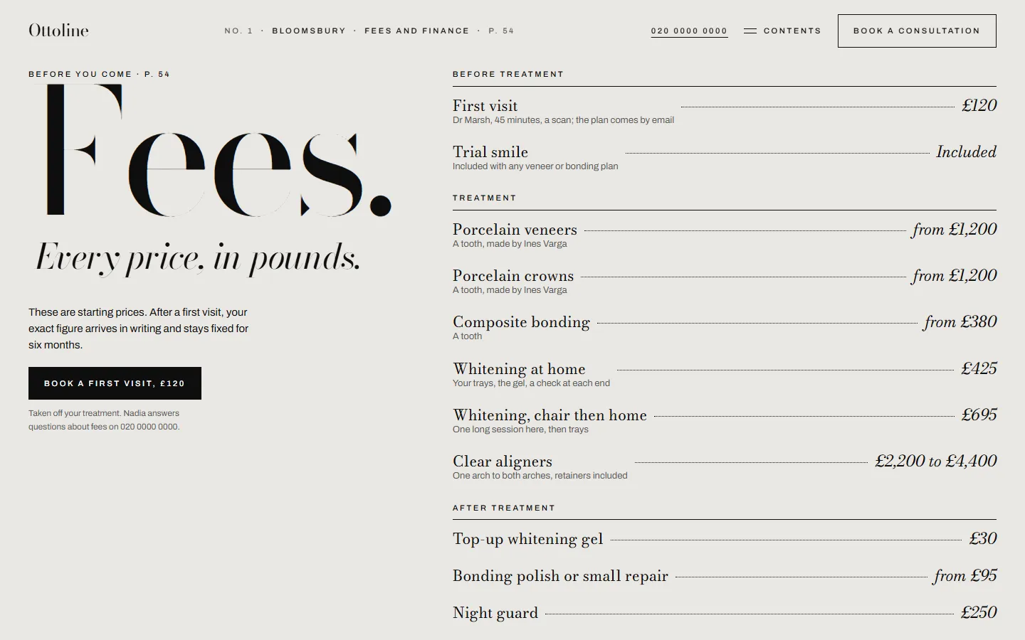
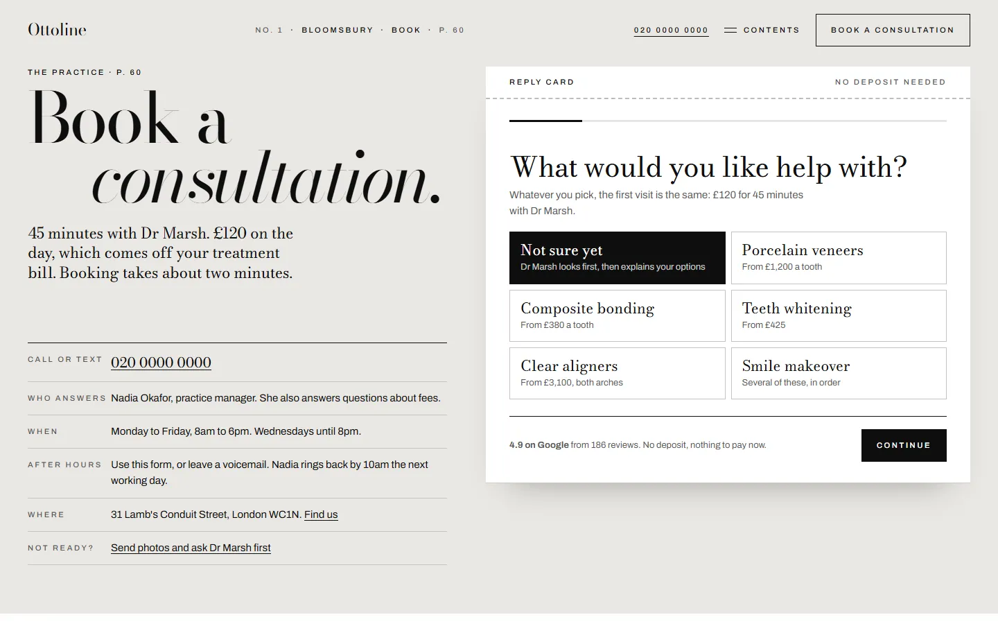
Each page borrows a different part of a magazine. The veneers page is one giant letter V. The fees page is a price list. The smiles page is a contact sheet of nine frames, and you book on a reply card.
The layouts come from references I measured, among them Irving Penn's corner portraits, Paola Kudacki's tight crops and a spread with a letter the full height of the page.
Next