
Website · med spa · concept
Solenne
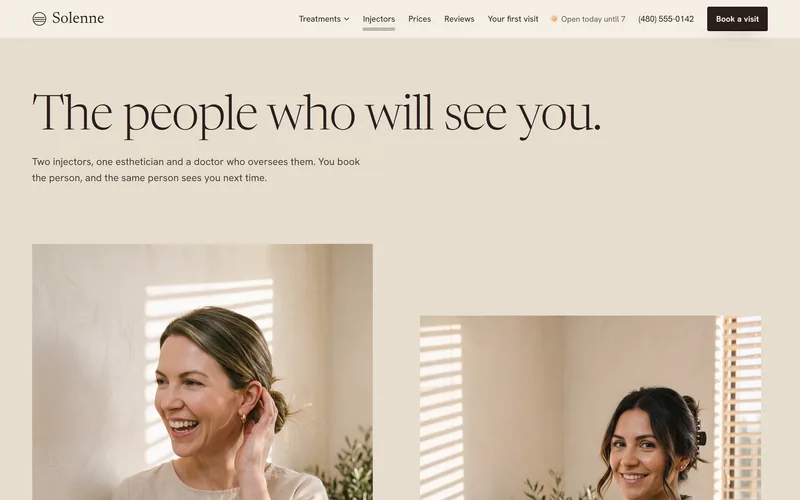
Each injector named, with a next opening.
- Made
- The site, with a hand-off to booking
- Pages
- Treatments, injectors, prices, first visit
- Status
- Concept, not a real clinic
Concept · the brief I set
- The practice
- An invented med spa in Old Town Scottsdale.
- The idea
- A calm, personal clinic, with clear information about its injectors, its prices and the first visit.
- For
- Someone comparing two to five med spas, arriving from Google or a friend's text.
Solenne is a concept, not a real clinic. The clinic, its team, its prices and its photographs are invented. The design decisions are real.
01 · Two directions
Late sun, or a bright morning.
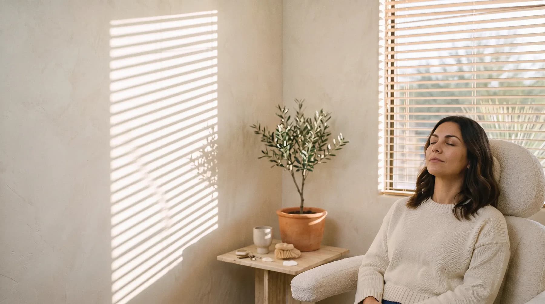
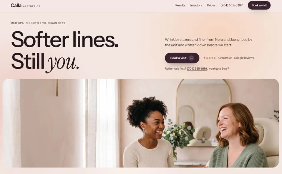
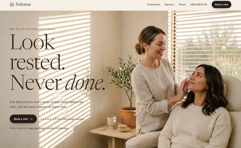
I drew two directions as working first screens. One was a bright morning room with rounded frames. The other was a room in Scottsdale at five in the afternoon, with the sun coming through the blinds onto the plaster.
I chose the late afternoon, and kept the morning direction's best idea: two weeks of a client's recovery that you play by scrolling.
02 · One world
Everything answers to one sentence.
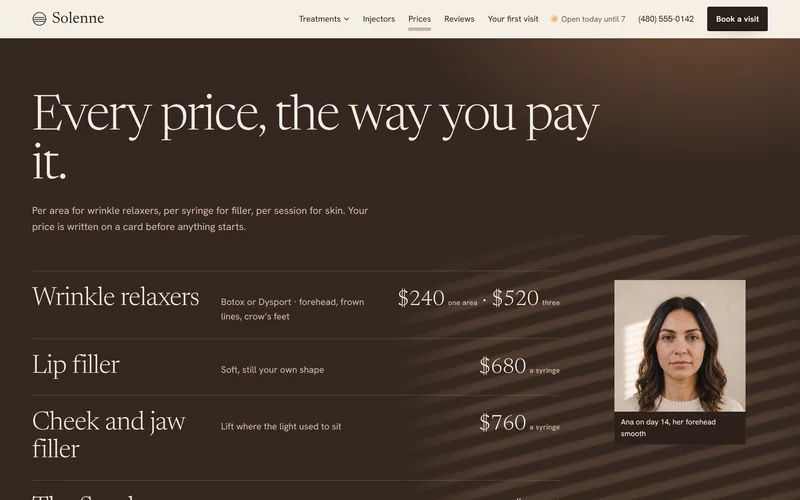
Before any page, I wrote the world down: a Scottsdale med spa at five in the afternoon, sun through the blinds onto the plaster, and the price written down before anything starts. Each part of the site follows from it.
- 01
Photographs
One room in warm side light, with candid moments. Nothing is laid over a picture, so faces and skin look true.
- 02
Color
Linen and plaster for the day, and a dusk brown for the prices and the footer.
- 03
Type
Newsreader for headings and Hanken Grotesk for reading. Emphasis is light: a faint band of slats falls across one word.
- 04
Words
The town and the trade in the first sentence, then short, plain lines a new client can take in at a glance.
- 05
Movement
The light moves. Drawn slats slide over the plaster as you scroll, and prices roll into place.
03 · What changed
One client, resting in the sun.
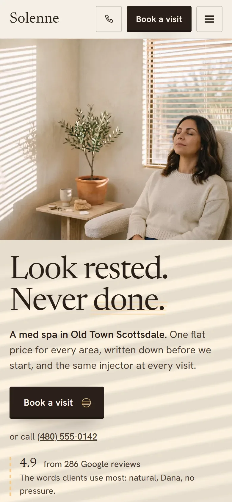
The first screen began with a label over the headline, an italic word and a photo of two women. The label and the italic went, because in this world the light does the emphasis. The headline got heavier so it reads clearly over the photograph.
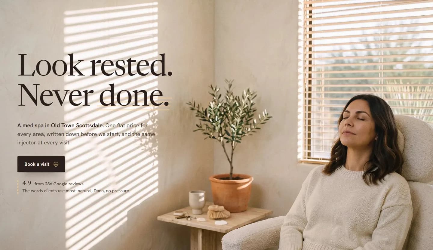
The photo of two women went too, because the smile looked forced and one hand looked wrong. The first screen is now one client resting in the sun, the calmest form of the idea.
04 · What the research decided
Research shaped what it says. The light is a creative choice.
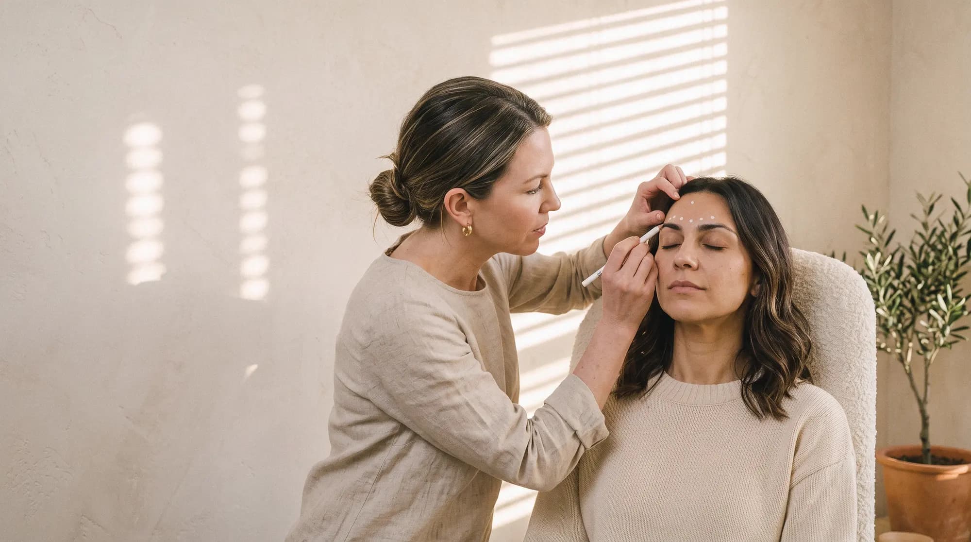
Before the design, I read what med spa clients write in their reviews. Good reviews often name the person who treated them, so each injector has a page with their license, their years and their next opening, and each treatment page names who does it.
Right after the first photo come three promises: one price per area, the same injector every visit, and a person on the phone. Those are this invented clinic's policies, not findings, and a real clinic would set its own. The five o'clock room is a creative choice. No review asked for it.
The counts: the design used my first read, where 139 of 205 positive reviews name a person. A larger read afterward found the same pattern: 669 of 1,152 positive reviews, from 1,514 across 114 clinics, name the person who treated them.
Next